Pivots are tools to query and visualise your data. To ‘pivot’
your data is to segment and filter it, in order to view it from different perspectives.
There are two kinds of field in your source data:
Value fields
such as Claims, Premium, Profit contain only numbers.
Category fields
such as Region, Year or Client can be used to segment value fields.
Pivots in Quantemplate allow you build tables with multiple
categories and values through drag-and-drop, then visualise the results as a graph.
For example, you might select your Gross Written Premium (value), segment it by year
(category) and by region (category), then show the results as a bar chart.
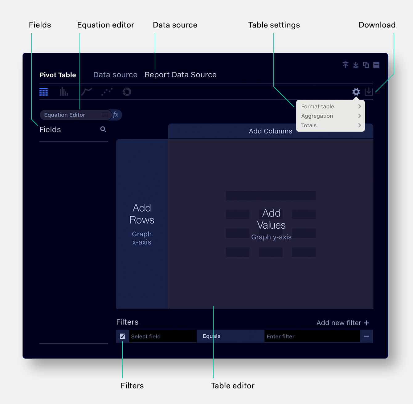
Pivot interface
Fields
These are the column headers in your source dataset. Drag and drop
them into the Table Editor on the right.
Equation editor
Perform on-the-fly calculations with your source
data, e.g. Loss Ratio = ‘Claims’ / ‘Premium.
Data source
Select the data source to query in your pivot. This can be either
the Report Data Source, which applies to all your Pivots, or another data source stored
in Quantemplate.
Table settings
Set the aggregation type for your data (sum, count, mean, etc).
Download
Download the filtered and pivoted data as a CSV file.
Filters
Filter the data in your pivot, e.g. ‘Year’ ‘Greater than’ ‘2004’.
Table editor
Configure the structure of your Pivot.
Add values
Drop Value fields into the central region. If you graph the results,
these categories will form the graph y-axis.
Add columns
Drop Category fields into the top region to segment the values
into columns. If you graph the results, these categories will form the graph key.
Add rows
Drop Categories fields into the side region to segment values
into Rows. If you graph the results, these categories will form the graph x-axis.
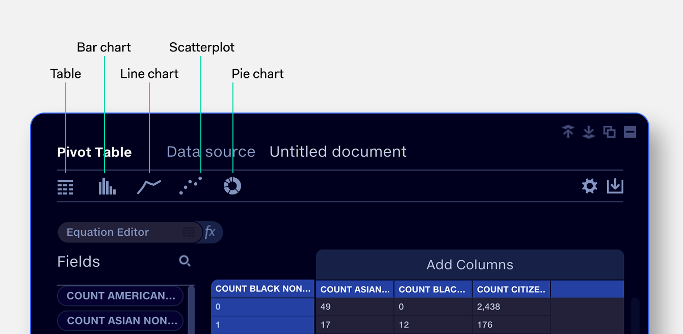
Data display options
Display your data as a table, or one of a range of graph types.
Table
Query and segment your data, presenting the results in tabular form. See