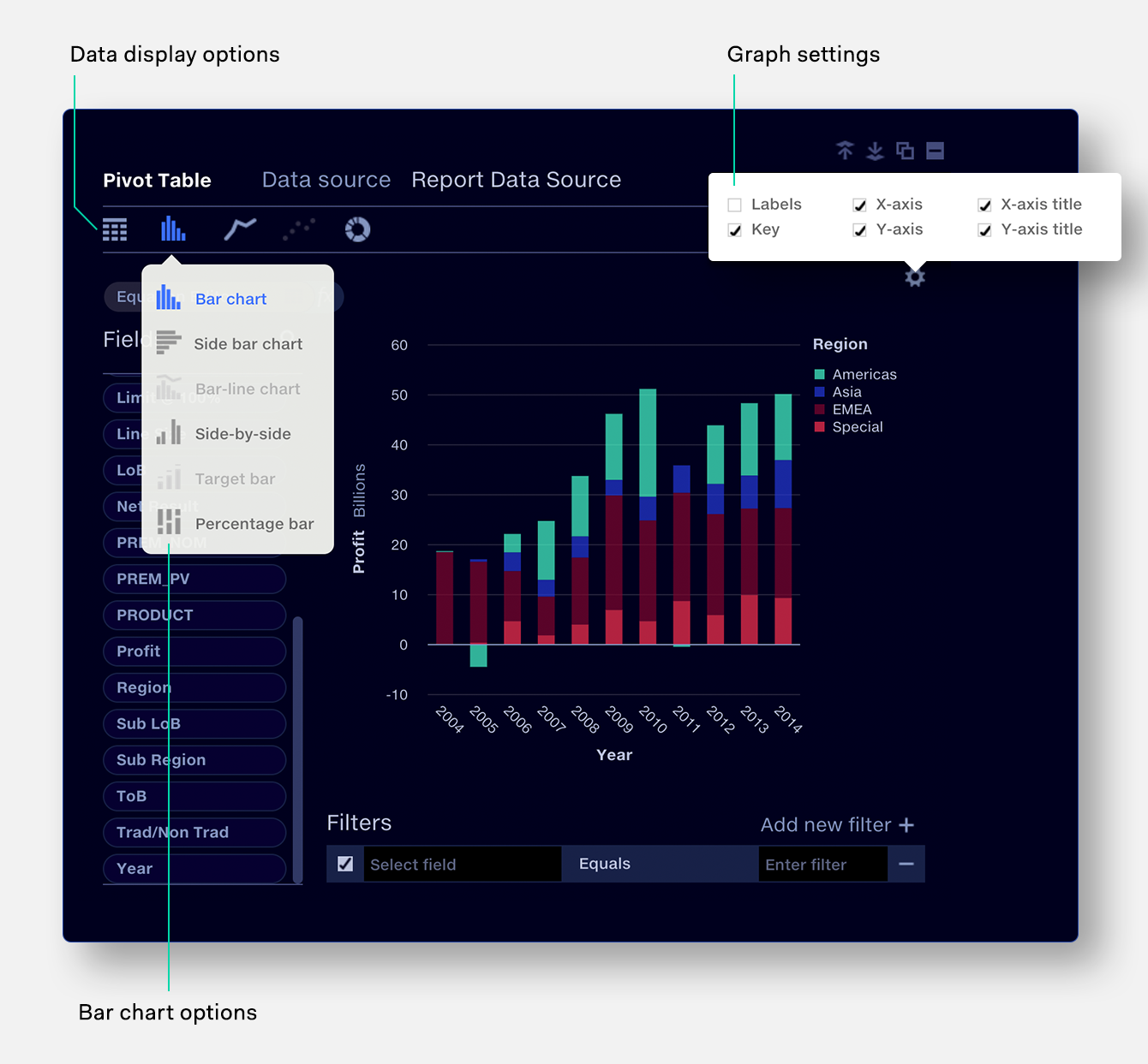
Quantemplate graphs are made using the
pivot frame. This allows you to configure your data, instantly see it visualised,
then switch back to table view if further configuration is required.
Try different options to see which
expresses your data best.
Graph data requirements
Graphs are inherently only able to show a certain number
of values and categories; for instance a pie chart can show one category and one value, whilst
a bar chart can show up to two categories by segmenting the bars. If more values or
categories are shown on a bar chart than can be shown on a particular graph type,
that graph is disabled. See graph types for details of data
requirements for each graph.
Graphs can be resized and their axes, labels and keys configured via the graph settings popup.
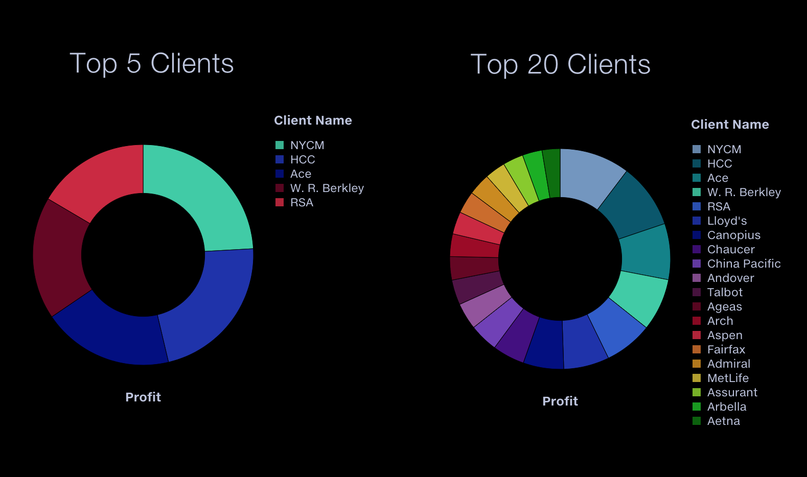
Colour palettes
Categories in a chart are assigned colours following their ordering in the pivot table. This will usually mean alphabetical/numerical order, but there are exceptions: if a ‘Top’ filter is applied and only one category and value are shown, results are sorted by magnitude (large to small).
A chart with two colours will use a different colour selection to a chart with five colours or twenty colours. This is ensures good colour separation in charts with fewer categories and a harmonious colour scheme in charts with many categories.
Note that with multiple charts made from the same data source, if some categories are filtered out, then the colours for identical categories may not match across charts.